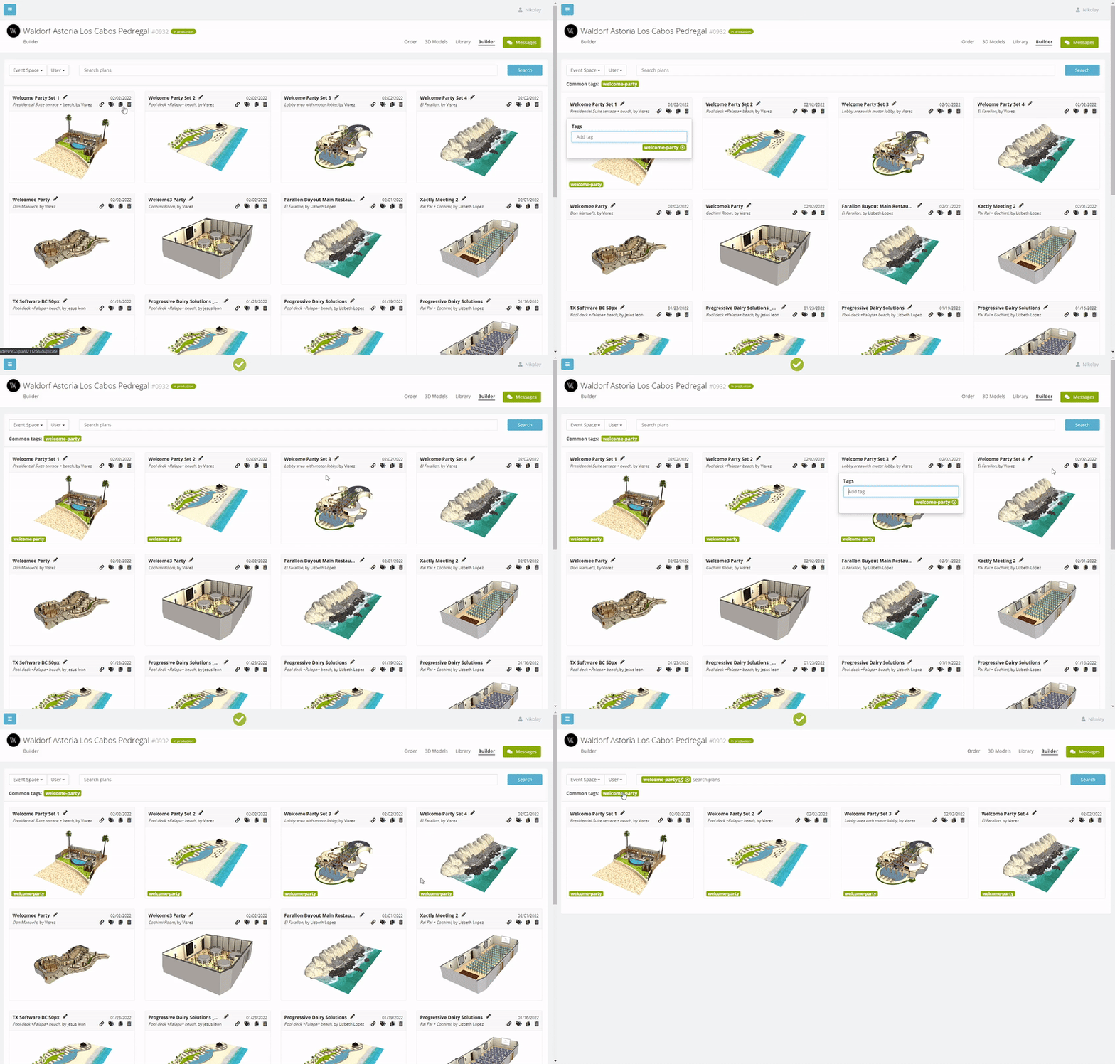
As the number of plans in client accounts grows users have asking for ways to organize the plans pages more efficiently. Our team initially considered folders but decided it would be better to allow users to add Tags and make these searchable. The benefit of this is it keeps all the plans visible on the one screen rather than having plans inside multiple folders. We have been testing it out for the last few days and it works great. The first step is to create a tag by clicking on the Tag icon on the event plan preview.
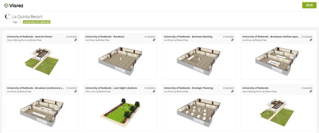
The benefit of tags is that you can share a unique URL with your client showing all the plans across multiple spaces. So if a group is using multiple spaces you can create a tag for that group and share a page featuring all their plans outside of your Visrez account. This is really useful for managing the communication between client and the on-site team.
Sharing Public Pages
From the shared page the user can open any of the event plans and if they have been set up as a partner they are able to edit any of their plans. Remember anyone access to the Shared Page Shortcut will be able to view the plans but only partners can edit plans.
Tags are shared across all users in the account so when one team member creates tags for their events they will be displayed for all other team members. The Search Bar displays a summary of the most common tags so you can filter through hundreds or thousands of event plans with one click. In a future release we will add a date selector so you can filter plans by Week, Month, Year etc.
Show Distances
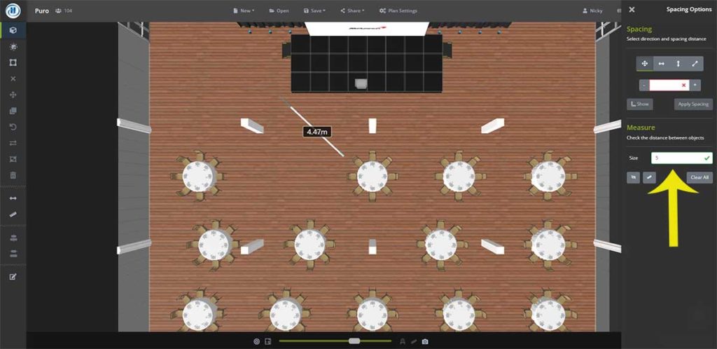
Another new feature is a button to display the distances between objects with one click rather than having to use the measuring tool. This is a very useful way to check the distance between two objects. If you are measuring a room full of tables or chairs the builder will just show a single measurement rather than the same measurement many times.
Users can now also adjust the width of the measurement line to make it stand out more in larger spaces.
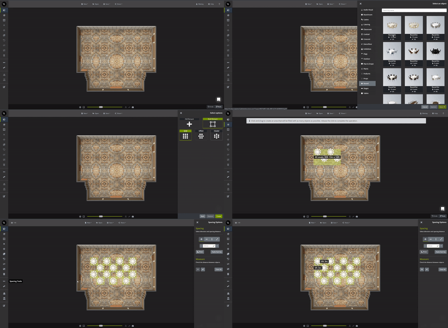
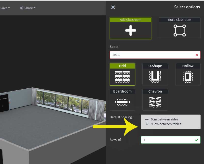
Default distances are now displayed so users understand the spacing before you place the objects.
Help Guides now in Builder
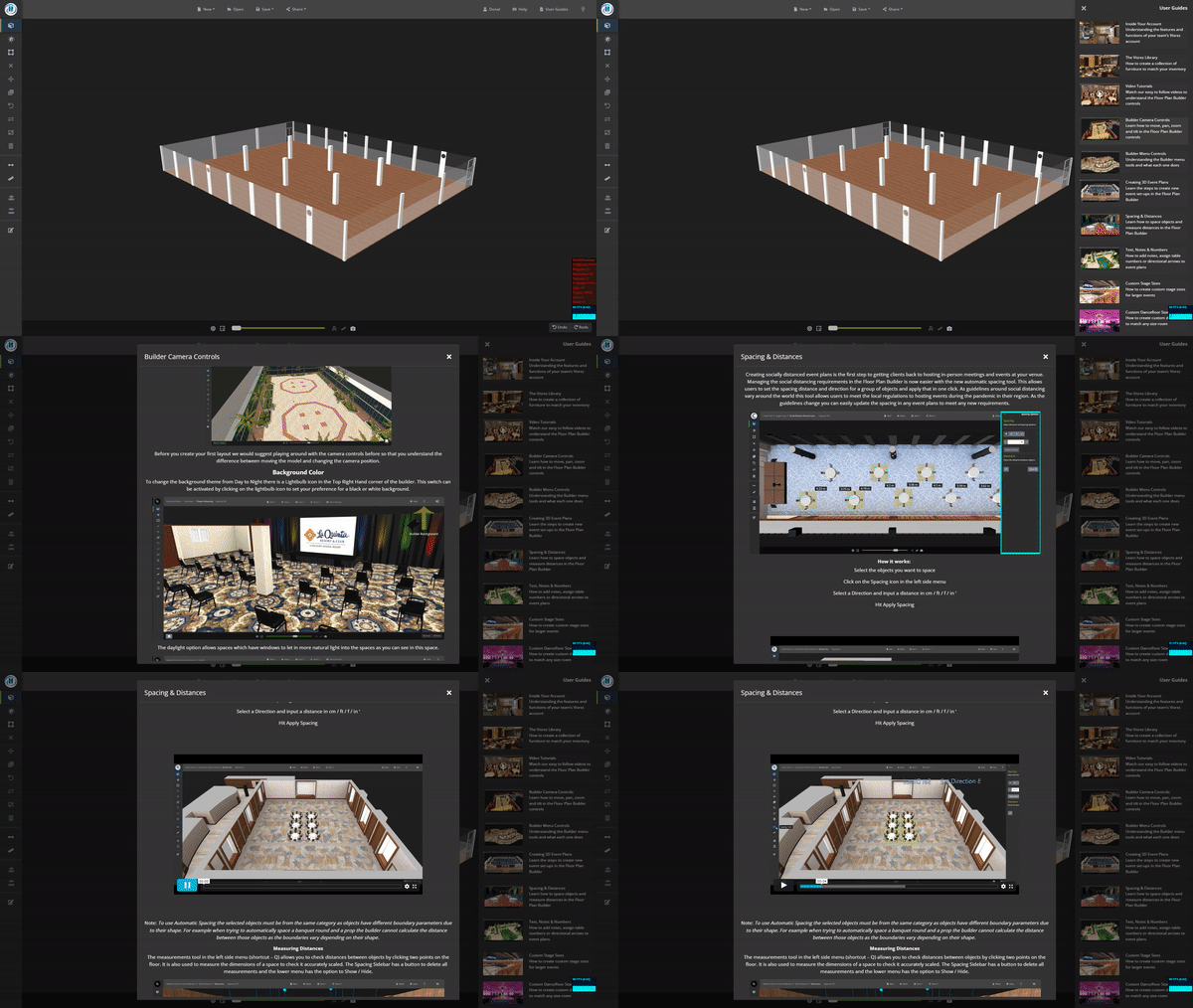
Our team has also moved the Help Guides inside the builder so you no longer have to go back to the platform to access the guides when you are working in a space. The Floor Plan Builder guides are now inside your builder.
New Keyboard Shortcuts Icon
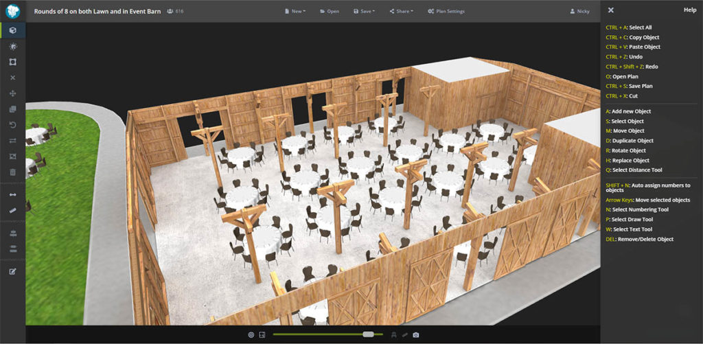
We have made it easier to find the keyboard shortcuts inside the help section of the builder. You can quickly see a list of keyboard shortcuts by clicking on the icon at the top of the help section.
We have a new logo
Our original logo had served us well but it was time for a change. Towards the end of last year our designers began working on concepts for a new logo. We wanted to communicate the magic of Visrez and how our team can recreate any space starting from a basic model. We are delighted with the result and hope that it also resonates with clients.

